The More, the Merrier: Meeting Sign-up Minimums for Multi-Participant Studies
Published July 18, 2024
Post in a Nutshell
Key Takeaways
- New setting: Participant Sign-Up Display
- Allows participants to see current signup numbers for available timeslots
- Reduces cancellations when studies require minimum signups
Seeing Sign-ups: From Bias to Benefits
Question:
If a study requires a minimum number of participants, how can researchers help participants with sign-up scheduling so that:
1) As many timeslots as possible meet minimum participant requirements?
2) Timeslots sign-ups are coordinated (participants tend to fill timeslots with existing sign-ups first)?
3) The researchers can avoid canceling timeslots (and disappointing the participants who signed up for them) because of unmet minimum requirements, and then compensating for this by adding many more timeslots than they’d otherwise need?
Answer: The researchers use the new Participant Sign-up Display and explain to participants how they should use this information to maximize their chances of participating in their chosen study at the chosen time.
Conceptual Clarity: What are multi-participant studies?
To those familiar with multi-participant studies, this new feature undoubtedly sounds great! This assumes, however, that the reader is familiar with multi-participant studies. We wish to avoid making any such assumption, so we’ll start with a definition. “Multi-participant study” is, after all, a technical term. In fact, it’s so technical that we may have just made it up. Luckily, the definition is simple. A multi-participant study is any study that requires more than one participant per timeslot. The key here is the “requires” part. It’s not enough that the study can have 3, 4 or 100 participants. Rather, it’s that the study must have at least n participants (where n>1), and for each timeslot. Also, multi-participant studies may require a specific, or “fixed”, number of participants (such as two per timeslot).
Now that we’re all on the same page, you may already see why the new Participant Sign-up Display feature would be so exciting to any researcher running multi-participant studies. Unfortunately, researchers who rarely or never conduct such studies may immediately be concerned that this new feature is now the standard display. They need not worry! The Participant Sign-up Display is an optional setting, and it isn’t the default one. Furthermore, the setting applies to an individual study. Enabling it for one study won’t affect the sign-up display for other studies.
This still leaves the question of why, if this setting is so great, it isn’t the default for all studies. The answer is one of context.
Contextual Clarity: Why the old view remains the default and when context requires the new display
One reason the new setting isn’t the default has to do with studies using confederates (individuals who pretend to be participants or just uninvolved in a study when they are really playing a role for the study). If a participant knows that e.g., only one other participant signed up for their timeslot, and they find four “participants” in the lab instead of two, that’s a lot worse than a potential bias.
But such studies are not the norm, nor are confederates the only reason not to display sign-up numbers. A more general reason is the desire to control for as many potential confounding factors as is possible. That’s why it’s still the default option. There are, though, study designs that provide a counter-example to those with confederates. Sometimes study protocols call for participant pairs, sometimes small balanced groups, and sometimes for a larger group or groups (e.g., a mock jury or competing teams). For these multi-participant studies, it would be much easier to fill up timeslots if participants could somehow favor those with existing sign-ups. Rather than have sign-ups spread out rather randomly (if not uniformly), this would mean timeslots would tend to fill up one after the other.
The problem? If participants don’t know whether timeslots have any sign-ups (let alone the exact number), they can’t very well favor these. They certainly can’t distinguish between e.g., a timeslot with 0 sign-ups and one that only needs a single additional participant to meet the minimum number required. No matter how much they might want to, they simply don’t possess the information needed to fill up timeslots other than by happenstance.
That’s no longer the case. Now, researchers can choose to have this information easily displayed as part of the sign-up process. Below, we’ll show you where researchers can find this option, what it means (and doesn’t mean), and some guidance on when and how to use it.
Enabling Participant Sign-Up Display
Before we go any further into when to use this feature, we should really start with how to enable it. Luckily, it’s straightforward and simple. First, it’s only for lab studies, so you don’t have to worry about how it would or wouldn’t work for other study types. Next, if you have a lab study, then go to that study’s information page, click on the Study Menu and select Change Study Information from the dropdown menu, and scroll down until you see the setting “Participant Sign-Up Display” (shown below):

Note that this option is for lab studies only. If you are looking at the Change Study Information page of an online study, you won’t see this setting. Also, note that the default option is “no”, which is another way of saying that this feature is turned off unless a researcher changes the setting to yes.
Finally, the reason that this setting is found on a study’s Change Study Information Page (rather than e.g., a particular timeslot or on your site’s Settings page (which only administrators have access to) is that it is a study-specific setting. It is not a setting for individual timeslots (lower-level) nor one that applies across studies or study types (higher-level). Practically speaking, this translates into the following: If a certain lab study has Participant Sign-Up Display enabled, then participants will be able to see study sign-up numbers for all timeslots added to that study, but only for that study (i.e., the setting won’t affect other studies’ timeslots).
Now that we’ve seen how to enable it, we can actually look at what the Participant Sign-up Display…well, displays. That is, what do participants actually see and how does this differ from what they would see if the setting were not enabled?
What Participants See
To get a better idea of how this feature changes what participants see, we’ll need a participant and some example studies. For brevity and simplicity, let’s look at two (imaginary) studies that are both in-progress. This is the minimum needed to contrast what participants see with this setting enabled and what they would see if it were not.
We’ll be looking through the eyes of our volunteer participant Echo Sprite (Felis catus), who has kindly allowed us to view his participant account for educational purposes.
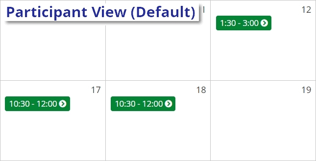
We’ll first look at a study with the Participant Sign-Up Display default setting (i.e., disabled). Echo logs in, sees the study, clicks to view timeslots and here are a few of the days that have them:

Nothing special. Just the times that Echo could select if he were interested in signing up.
Now comes the important part. Another lab study has the new feature enabled, and we want to know what Echo will see in this case.
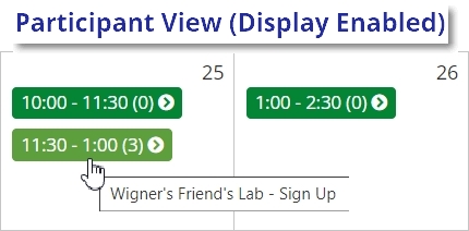
So, once again, Echo kindly selects the study for us, clicks to view timeslots, and here are two days with timeslots:

With Participant Sign-Up Display enabled, Echo can now see not only the available times for these days, but also a number next to each time. That number corresponds to the current number of participants who have signed up for that timeslot. Note that Echo only sees a single number, so both the minimum number of participants desired and the maximum number of participants required per timeslot are still unavailable to him. The reason no minimum is displayed is simply because this is information that will change from study to study and researchers will need to decide how best to inform participants about it (more on this later).
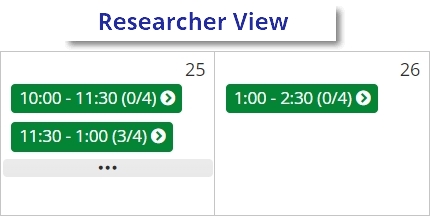
The maximum number is also not displayed, but for different reasons. To better understand why, we can compare what Echo sees with what a researcher would if using the calendar view:

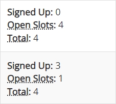
Researchers can see both the current number of signups per timeslot and the maximum number of participants (specified for each timeslot). We can see this information even more easily if we look at what the researchers see using the default view rather than the calendar view:

For researchers, all of these numbers are important, which is one reason the calendar view isn’t the default timeslot view for researchers. Moreover, unlike participants, researchers really need to see timeslots after they’ve reached the maximum number of participants. It’s not hard to understand why.
For participants, a filled timeslot means an unavailable timeslot. Researchers, however, continue to care very much about filled timeslots, and so it is at least as important for them to easily see whether a timeslot has 3/4 signups vs. 4/4 signups. Participants won’t see a filled timeslot at all, and this information isn’t needed.
Now that we know what Echo sees (and doesn’t see) we can ask what this means for him. If Echo is told that, for this study, timeslots with fewer than 2 participants will be cancelled, then he’ll want to select the one that currently has three participants. If he selects either of the other two, there is a risk that no other participants will choose those, and they will have to be cancelled.
This brings us rather nicely to how reseachers can use this feature to better coordinate timeslot scheduling for multi-participant studies, streamline the sign-up process for these studies, reduce timeslot cancellations, and more!
How it Works: Using the Participant Sign-Up Display option to precent cancellations and boost research productivity
We now know what participants will see with Participant Sign-Up Display enabled (thanks to Echo), but it may not immediately be clear how this will help researchers running studies that require a minimum number of participants.
This is the point where a more concrete example can go along way, and we have one ready.
Example Study: The Setup
We’re going to make things a little more concrete now by using an example study. What the study is about doesn’t really matter. It only matters that the researchers need at least X number of participants per timeslot (whether X is two, three, four, etc.).
Suppose our researchers are interested how the act of arguing for/defending a viewpoint can strengthen one’s beliefs about it even if they previously had none or were ambiguous. To investigate this, they plan to have participants engage in a semi-structured debate about a certain polarized topic. They have some measures of belief already thanks to Sona’s prescreen, and this allows them to recruit participants who are mostly middle-of-the-road, ambiguous, or undecided about the selected “debate” topic.
After both debate sessions, participants will complete another questionnaire intended to measure their position on the topic and how much their attitude towards it and related issues have changed (if at all).
For our purposes, all that really matters is that this study requires a minimum number of participants per timeslot. In this case, that minimum number is four, because there are two pairs of debate partners per timeslot (for the details, expand the section above!).
Now our researchers want to know how they can improve their chances of getting four participants per timeslot. This starts (and in some cases ends) with information provided in the study’s Brief Abstract and Detailed Description sections on the study’s Change Information Page:
The above image displays a hypothetical Abstract and Detailed Description for our Example Study (click to see the full image for easier reading). We don’t really want to know the exact words the researchers used. That’s specific to the example study. We want something more like a procedure for taking a study design and determining what information participants need to know. We can use the process our researchers did for our example study as…well, an example.
First, participants need to be told something about the study and it would be nice if this included information about the number of participants required. So our researchers informed participants that they will engage in two “debate” sessions, that they will be switching debate partners, and (importantly!) to look for the sign-up number. Because each session or timeslot requires four participants, these numbers will help ensure participation success.
The researchers were also careful to explain how the sign-up display numbers work. They also pointed out why participants would benefit from this information, noting that any timeslot which does not reach 4 will be cancelled. Finally, they told participants to favor timeslots with existing sign-ups and made clear that the closer the sign-up number is to 4, the better.
They could have included more if they thought it necessary. For example, the researchers might have gone on to state that, if no convenient times close to 4 exist, then the next best thing participants can do is to look for timeslots with at least 1 sign-up. If the only convenient timeslots are those with 0 sign-ups, then participants shouldn’t be discouraged from participation, but they might be better off choosing a later date. If a timeslot with no sign-ups is coming up soon, it’s less likely to be filled than one that gives other participants more time to select it.
That’s how researchers used the Participant Sign-up Display in our example. And it actually tells us a lot about how researchers should handle informing participants in general. Researchers, though, tend to have curious and inquiring minds (this may have something to do with dedicating much of their lives to asking and answering scientific questions). And while they may find it easy to extrapolate from our example to their own studies, they are also likely to ask further questions such as “Why do I have to supply this information? Why isn’t the feature self-explanatory?”
Such inquiries may sound suspiciously like complaining (possibly because that’s how we wrote them), but they are nonetheless valid questions and they do raise an important point.
Why do researchers have to do the work
This new display gives participants crucial information, yet we’ve seen researchers also have to provide information in order to use it. Why can’t the display give more information? Why is it up to the researchers? These are fair questions, as we said earlier. The quick answer is that we want researchers to have greater freedom and flexibility here.
Partly, this flexibility and freedom is thoroughly practical. Consider how problematic it could be if the Participant Sign-up Display automatically informed participants that X study had a minimum of 2, when it fact it required exactly two participants. In other words, the term “minimum” is misleading in such cases. It’s technically the minimum, but also the maximum, and is better explained as the number required.
Also, participant pools can vary considerably. Some of these differences raise less practical but no less important issues that are relevant here. Imagine a pool with participants who have to meet research requirements. This means they must have a certain number of credits to pass one or more courses they are enrolled in (or perhaps to meet degree requirements). Compare this with a participant pool with students who can earn extra credit in exchange for participation, but who don’t need it (by virtue of it being “extra” rather than required). In the former case, researchers who provide clear, detailed instructions about how to fill up timeslots are helping participants meet their course or degree requirements. In the latter case, by contrast, participants may not be as motivated to sign-up for studies at all. For these students, what was helpful information may now appear overly restrictive and could discourage participation.
That addresses why we leave the task of informing participants to researchers, but we can still say a bit more about how researchers should provide what information when they carry out this task. We covered most of this using our example study. There, the researchers used the study abstract and description to provide all the information they thought that their participants would need.
It may not be enough, though, to simply put this information in the study description. Researchers may want to contact eligible participants more directly. If they run this type of study frequently, having a webpage or part of a webpage dedicated to the sign-up process that provides participants with information about this feature can be useful as well (and you can link to this post, too!). They may decide to handle larger minimum participant numbers differently than those requiring 2-3 participants. They may decide it’s worth giving more instructions for studies used to meet credit requirements. The takeaway is, again, that different contexts can mean giving participants different instructions/information via different means. Researchers need this flexibility, and we’re giving it to them!
Wrapping it up
That’s also pretty much it for how this feature works. It’s simple to enable and easy to use, yet it can do a whole lot to help researchers with studies requiring a minimum number of participants. It can even be used in more complicated cases, such as when the number of participants must be even. However, instructing participants how to use the display to help ensure their selected timeslots aren’t cancelled becomes more difficult here. Also, keep in mind that this feature doesn’t enforce minimum numbers (which is impossible). It’s designed to help participants keep the timeslots they choose from those available in the study they opt into from being cancelled. This in turn reduces cancellations that researchers would have to make if a timeslot failed to meet that number.
In short, everybody is happy (or at least, happier)!


