Some Tooltips: Per-participant timeslot info at your cursor tip
Published January 5, 2023
Tooltips: The Long and the Short of It
Like the feature we’re presenting, this post will be to the point. We’ve added a small but important change to the “Modify” screen for studies’ timeslots: Tooltips for each participant in any study’s timeslot. Before we explain what these are, it’s probably best to show you where they are so that you can follow along if you would like to.
Locating the Tooltips
First, select a study with timeslots added by going to your site’s “View Studies” page. Next, click on the “Timeslots” link for the study you picked:
On the study’s timeslots page, you may want to select the “All Timeslots” timeslots tab to see all possible timeslots for this study (don’t worry about possible consequences of making changes when selecting a study or timeslot, because we won’t be changing anything). A timeslot with more participants is better, but any will do as long as there is at least one participant signed up for that timeslot. Now click on the “Modify” button for the timeslot you’ve chosen. The new tooltips are next to the participant names for the chosen timeslot.
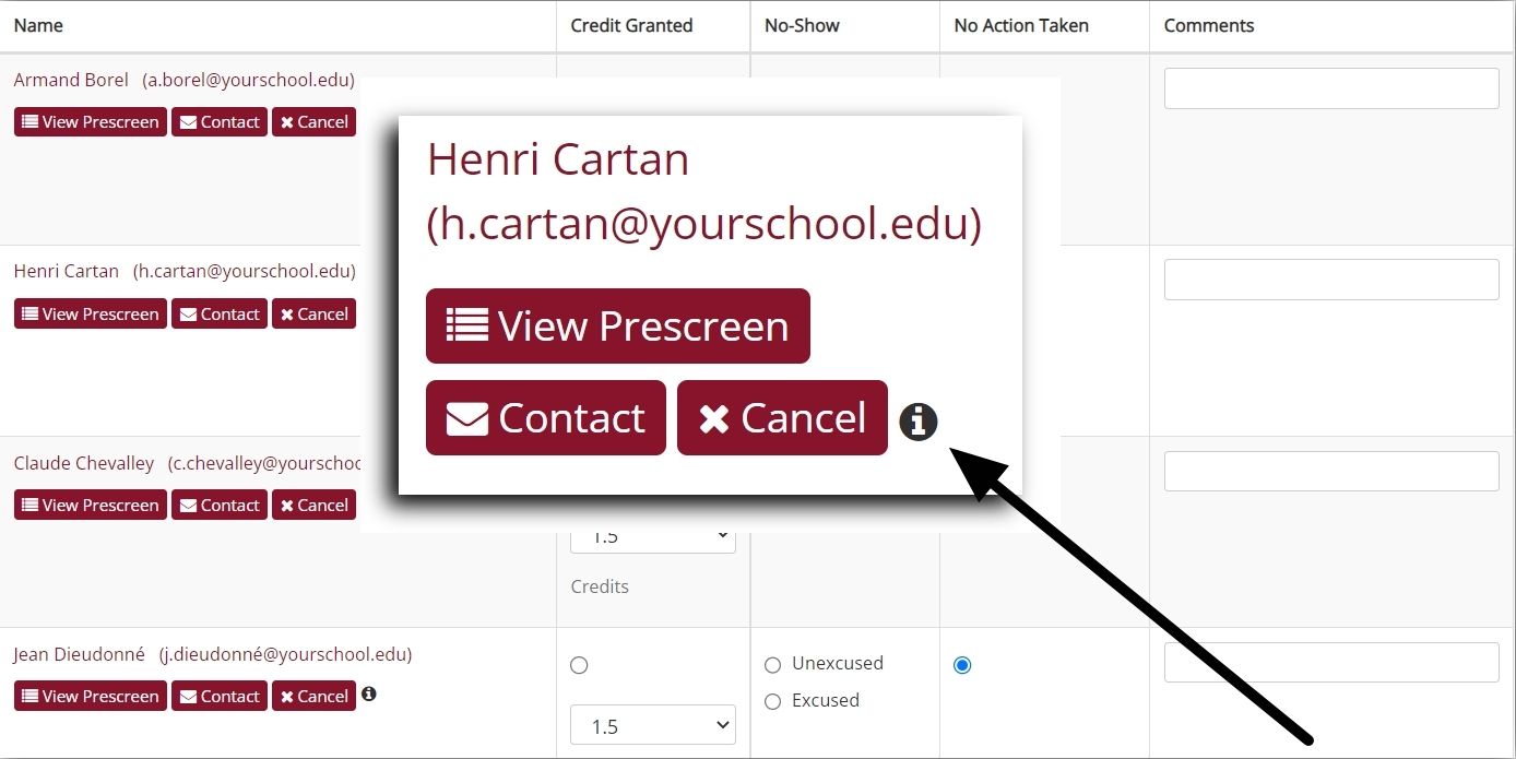
We did say earlier that the change is a small one, at least in terms of size (in terms of useful applications and importance, it’s anything but). Just to make sure you don’t miss it, we’ll zoom in on where you’ll want to look:
Notice the little circle with the “i” in it? That’s the new tooltip.
What Tips? The Tooltip Information Display
The tooltip allows you to view the most crucial information specific to both a study’s timeslots and participants. This is for every study (regardless of type), every participant, every timeslot, with all the information in each instance obtained simply by moving your cursor over that “i”.
The tooltip display will also automatically adapt to a participant’s status and to the study type, showing only relevant information rather than a fixed, context-insensitive format. In addition to making the information more readable, we’ll see below how this adaptive display provides important details in what is not shown as well as by what is. First, though, let’s cover the possibilities.
For single part studies, the tooltip for a given participant in a given timeslot will display one to three key details, depending on status and study type:
- When the participant signed up for this timeslot
- When participation was marked
- When the participant clicked on an online study’s link
There is a possible fourth detail you can find, but it is only for multi-part online (external) studies so we’ll cover it a bit later.
Clearly, what you’ll see for a given participant in a particular study is context-dependent. For instance, standard, “in-person” studies do not have “Link Clicked” dates. There are, naturally, other nuances at play, as we’ll see. Let’s start with the simple example of a timeslot for an “in-person” study scheduled for some future date.
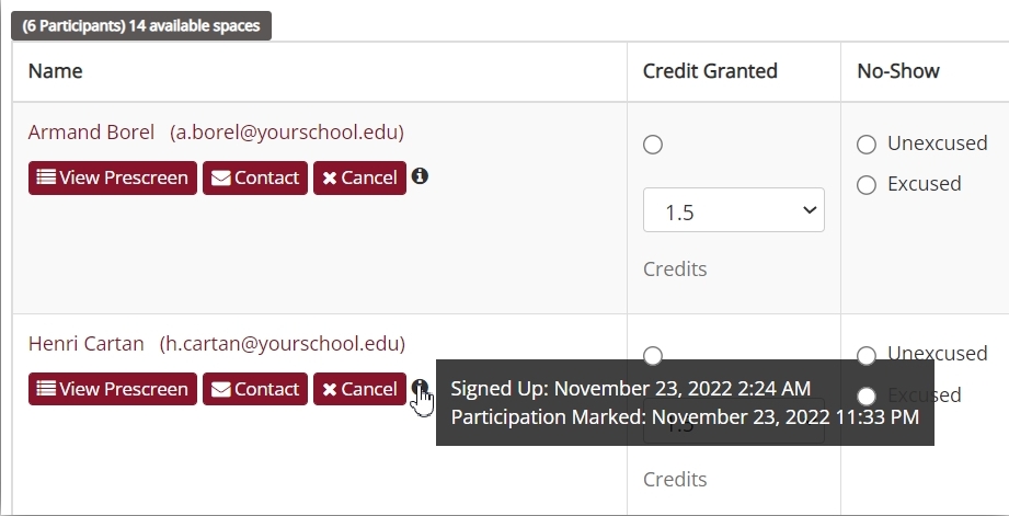
In this case, participants have selected a date that hasn’t yet occurred, so moving the cursor over the tooltip will show the only information possible:
Even this case can give you a lot of information. If a particular timeslot suddenly goes from having 0 participants when last you checked to the maximum allowed, you can quickly get a feel for when participants signed up.
If the timeslot is in the past, you can also see the date and time participation was marked:
Finally, for online studies, you can see all three details we listed earlier:
Link Available: A Fourth Option for Online Multi-Part Studies
When we listed the three details you might find in the tooltip display, we mentioned a possible fourth, but we put off discussing it until later. That time has come. For online, multi-part studies the tooltip display will contain the Link Available date range. Of course, just telling you the name “Link Available” doesn’t convey much, so let’s use a simple example.
Suppose we have an online, external two-part study. When adding the study, we have to specify a Part 2 Scheduling Range:
We used 48 hours and 24 hours for our example range. This means a participant who completes Part 1 of the study won’t be able to click on the link to Part 2 for another 48 hours. Also, once the link becomes available, it will remain so for only 24 hours.
Although this specified range remains constant, the actual date and time that the link to Part 2 will become available is specific to each participant. These depend on when a given participant clicked the link to Part 1.
For general two-part online studies, then, each participant will have a different date and time that the link to Part 2 became available. And that’s not even taking into account three- or four-part studies! This can be a lot to keep track of. That’s why there’s a tooltip display specific to this study type:
This is a tooltip display from the timeslot to Part 2 of our example two-part study. As you can see, it includes the Link Available information. In our case, the display shown above tells you when the link to Part 2 will become available to this participant as well as how long it will remain available to this participant. If we were running a three- or four-part online, external study, we’d find similar tooltip displays for Part 3 and Part 4 timeslots.
The Link Available details allow researchers to easily track when different parts of a given multi-part, online study become available to participants.
Putting it all together…and to use!
The tooltip display information itself is not new, of course. You can find these data in e.g., the Download Participant List for a given study. What’s new is how incredibly convenient and easy these tooltips make getting the most crucial facts. And because you are already looking at a particular timeslot for a given study, you’re getting data more specific than you would from looking at participation for the entire study at once.
For a final illustration of how useful this can be, as well as what you might see for a particular study type and participant status, consider “the curious incident” of the automatically ungranted credit for an online study. What do we mean here? Apart from the Conan Doyle reference (The Adventure of the Silver Blaze), we’re referring to participants who have signed up for an online study but haven’t received credit, even though the study is set up for automatic credit granting. Here’s what you’d see:
What does this mean? In this case, the participant did click on the link. We know that because the tooltip gives us the exact time. But for some reason the participant was never redirected back to their Sona page to be granted credit automatically.
There are two possible explanations for this. One is that the study isn’t properly set up for automatic credit granting, and could require troubleshooting (see our Integration Help pages for additional support here). Alternatively, it could be that the participant in question clicked on the study’s link, but didn’t finish the study and so was not redirected back to your Sona site.
The tooltip details can be extremely useful in determining which of the two possibilities is more likely. If most participants have “Participation Marked” dates and times, while only one or a few don’t, then it’s more likely that these few simply didn’t finish the survey or task(s).
We can extrapolate a little here and consider what kind of information we’d get from a tooltip in all possible cases. We already saw one possibility for online studies in the first examples earlier: All three tooltip details are given. That’s because credit was granted automatically. In the case we just covered immediately above, the tooltip details indicated that the participant didn’t finish the online survey (or that the automatic credit granting isn’t properly set up). But there’s also one final possibility. A participant can sign up for an online study without ever starting it. In that case, here’s what we’d see:
Clearly, these tooltips can quickly give you a lot of information that you would have to work to get elsewhere. It’s also, if you think about it, pretty much the only information specific to each participant that you’d want to see for a given timeslot. This means there’s no more having to cross-check study logs and reports when what you want is to check on a situation specific to a particular timeslot, or even a single participant in that timeslot.
With these tooltips, it’s all there, for each study, for each timeslot, and for all participants…without the click of a mouse.


