Simplifying Study Sign-ups: Skipping Online Timeslot Selections
Published May 3, 2023
Several of our blog posts, including the most recent ones, have featured or focused on timeslots (e.g., “Awaiting Action”, Automatic Credit Granting, and the “Link Clicked” Date, Uncredited Timeslots: Back to the Feature “Past”, New View: Scheduling with the Researcher’s Calendar, etc.). There’s a good reason for this: Timeslots are central to scientific progress and consequently to researchers. It doesn’t matter how sophisticated one’s statistical analyses are, how expensive and powerful one’s instruments are, nor indeed how great or extensive one’s resources are (whether in terms of finances, supporting staff members, time, etc.). None of that translates into scientific progress or research that matters without actual data collected. For studies with participants, to have data means that participants must, well…participate. While a multitude of features the Sona platform provides help researchers and participants alike in a myriad of ways, ultimately it all centers around participants actually participating in the studies they sign up for. And for that to happen there must be time allotted for their participation.
You may have expected “time and place”, but this is not necessarily true, at least not in the sense that researchers must always set aside a particular place and time. Online studies are the big exception. And just as online studies don’t really have timeslots (more of a single, ongoing timeslot), participants in online studies don’t usually need to select one. It’s an unnecessary step.
At least, it was…
Sona Simple: Making things as simple as possible, but no simpler.
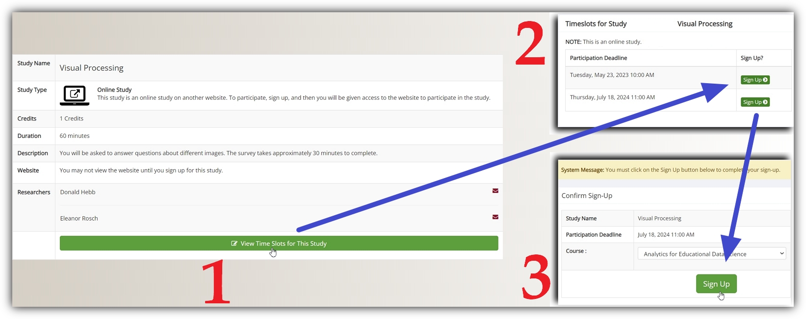
No more! We’ve removed this unneeded step to simplify the sign up process. To make this a bit more visual, as well as to clarify when this “removed” step will still actually be part of the sign-up process, let’s suppose we’re running an online study (perhaps for a vision lab) that has multiple, overlapping timeslots for some reason (more on this in a bit). In this case, participants will go through the standard 3-step sign-up process, starting from the study information page:
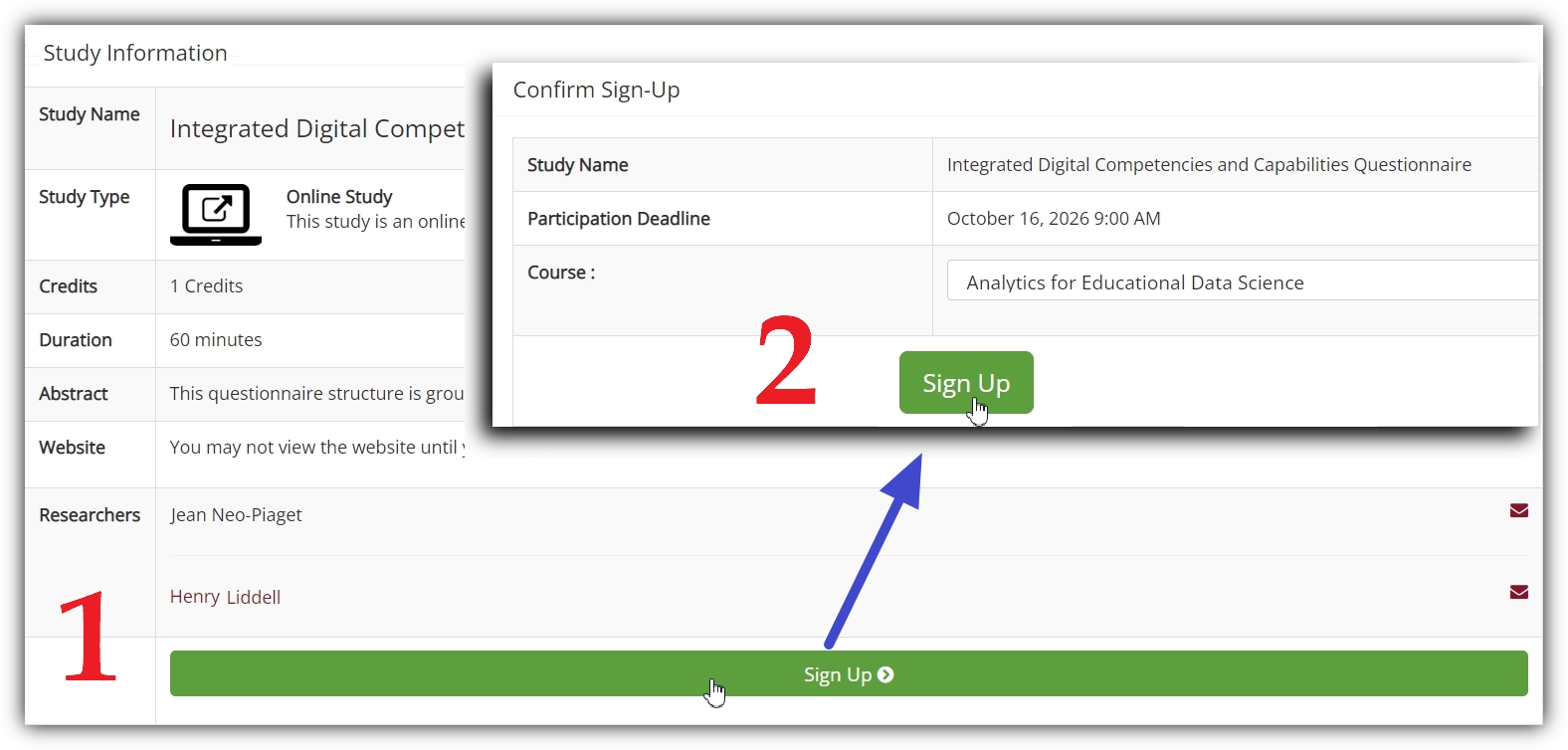
Now, participants for both internal and external online studies can go straight from the study information page to the sign-up page:
…and thereby skipping the unnecessary timeslot selection. The next question is “When is timeslot selection considered unnecessary?” Put differently, we want to address when participants will see the three step sign-up process with a button to “View Time Slots for this Study” and when will they see a sign-up button on the study information page (in the two-step process) instead. The asnwer is straightforward. In order for a participant to see the “Sign-up” button on a study’s information page (the two step process), all of the following conditions must be met:
- The study must be an online study (internal or external)
- It must have only one part (no multi-part studies will have this view)
- Only one timeslot can be available
It’s the last condition that’s the important one. It’s this condition that prompted the “more on this” comment we made above after supposing that the first example study had multiple timeslots “for some reason.” For online, single part studies, there’s typically no good reason to have multiple timeslots. In fact, from a certain perspective this newly streamlined process offers another incentive for researchers to add only one timeslot at a time for an online, single part study: Having multiple, concurrent timeslots available to participants means including a selection process that is almost always unnecessary and potentially even confusing.
After all, online studies allow participants to select the optimal time without any researcher action needed (still less some location reserved). So why not keep things simple? We’ve just made it easier to do so.


